UI, Design Systems, Tooling, & Teams
Discover how I have developed wonderful experiences that serve teams and customers.

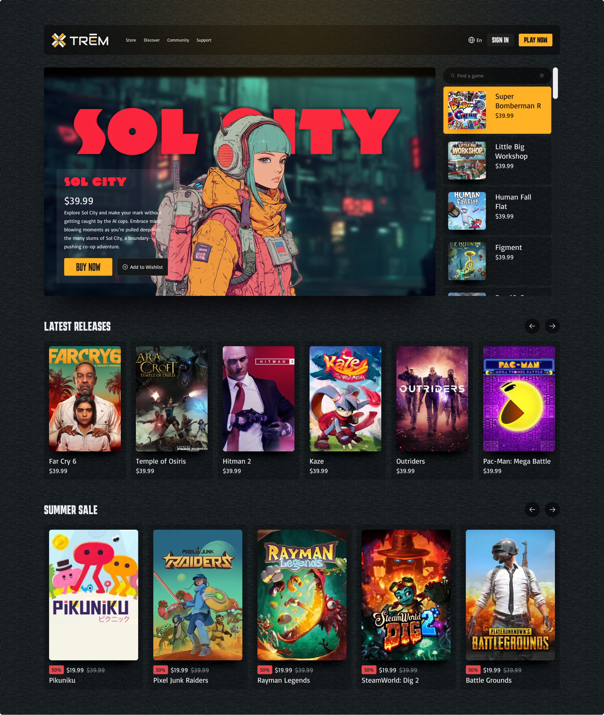
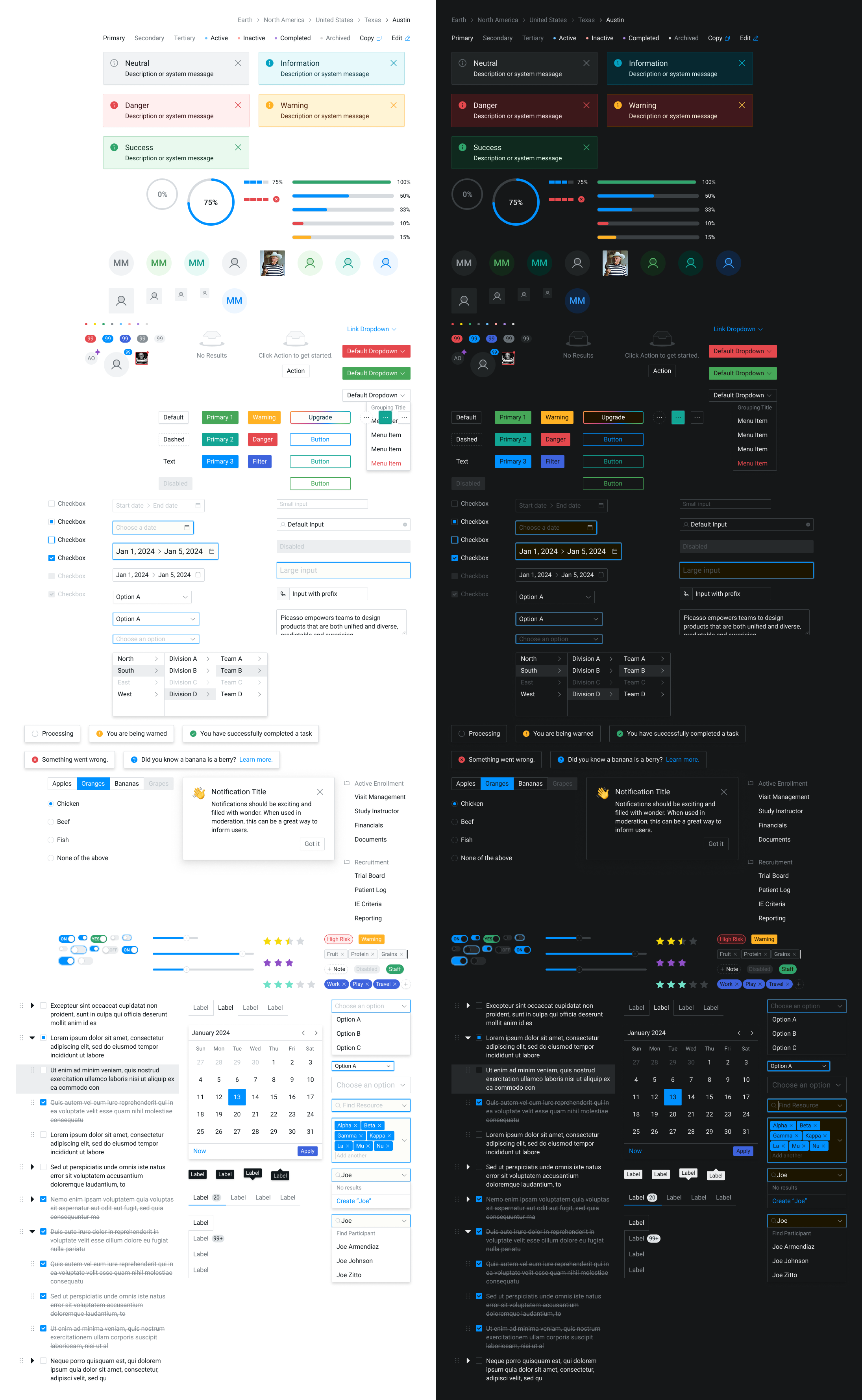
UI design
Good UI design is mostly invisible. When it’s working, users don’t think about the interface — they just accomplish what they came to do. When it’s not working, every confused click and abandoned flow is a little indictment.
Here’s what I keep in mind when I’m designing interfaces:
- User needs and goals — Start here. Every decision should trace back to what someone is actually trying to accomplish.
- Information architecture — How information is organized determines how hard users have to think. Make it easy.
- Visual hierarchy — Guide attention without being obnoxious about it. Size, weight, contrast, spacing — these are your tools.
- Consistency — Patterns, components, colors, type. When things behave the way users expect, they stop noticing the design and start trusting the product.
- Accessibility — Color contrast, text size, keyboard navigation. These aren’t nice-to-haves. They’re table stakes.
- Feedback mechanisms — Interactive elements should feel interactive. If a user does something, the interface should respond.
- Simplicity — Every unnecessary element is a question users have to answer. Cut ruthlessly.
The trifecta
There are some trios that will forever remain iconic. When it comes to a product team, the lead designer, product manager, and lead engineer should operate as a unit — a Trifecta, if you will.
I’ve been on teams where this worked well, and teams where it didn’t. The difference is almost entirely trust and communication. When these three disciplines are genuinely aligned, the whole team runs faster. Decisions happen in conversation, not in long email chains. Trade-offs get made with full information. The output is — and I’ll stand by this — 10x better.
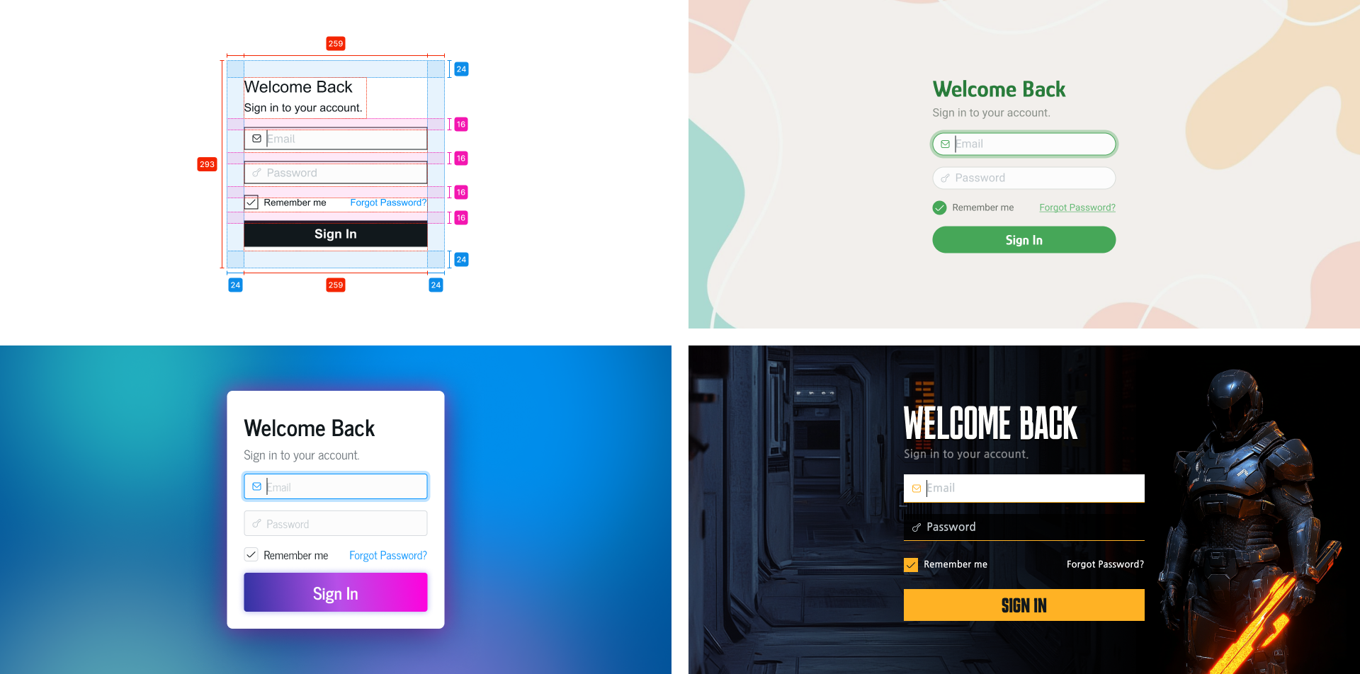
Design at scale
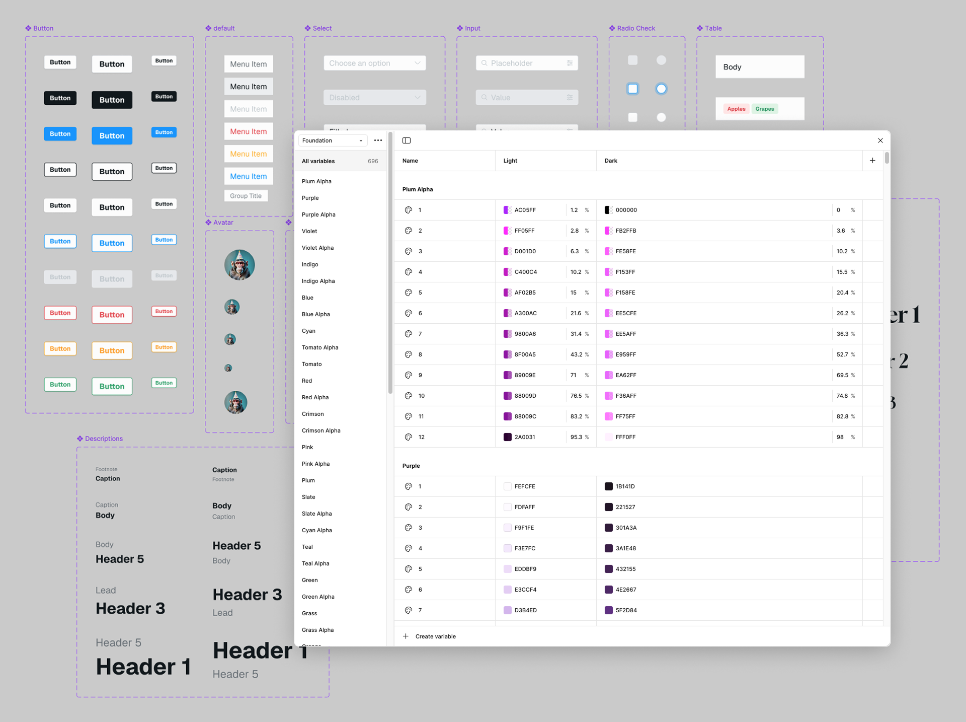
Once a project starts growing, I get aggressive about componentizing. In Figma, this means creating components and variants early — before things get messy — and being opinionated about naming. A UI Kit doesn’t have to be fancy to be useful. It just has to be consistent and shared. Learn more about my process.

Level up: design to code
Figma’s plugin ecosystem is where a lot of my workflow lives now. One I keep coming back to is Export/Import Variables. I use it to export my Figma variables to JSON — which sounds dry but is actually kind of magical when you see what you can do with it downstream.
// Example output color

{
  "id": "VariableID:2:11",
  "name": "Red/9",
  "description": "",
  "type": "COLOR",
  "valuesByMode": {
    "2:0": {
      "r": 0.8980392217636108,
      "g": 0.2823529541492462,
      "b": 0.3019607961177826,
      "a": 1
    },
    "2:1": {
      "r": 0.8980392217636108,
      "g": 0.2823529541492462,
      "b": 0.3019607961177826,
      "a": 1
    }
  }
},
... more
Style Dictionary
Once I have that JSON, I run it through Style Dictionary to generate actual usable code — CSS variables, Tailwind config, whatever the project needs. This is the part that makes engineers’ eyes light up a little when you explain it: your design tokens live in Figma, they export to JSON, and Style Dictionary transforms them into production-ready code. The source of truth stays in the design tool, and the code stays in sync.
// Example Style Dictionary manifest
{
  "source": ["./tokendata/**/*.json"],
  "platforms": {
    "tokenlib": {
      "transformGroup": "custom/group",
      "buildPath": "./dist/",
      "files": [
        {
          "destination": "tokens.css",
          "format": "custom/css/theme"
        },
        {
          "destination": "tailwind.custom.js",
          "format": "custom/tailwind"
        }
      ]
    },
  }
}
/* Style Dictionary CSS Output */
@media (prefers-color-scheme: light) {
:root {
--red-1: rgba(255, 252, 252, 1);
--red-2: rgba(255, 248, 248, 1);
--red-3: rgba(255, 239, 239, 1);
...;
}
}
@media (prefers-color-scheme: dark) {
:root {
--red-1: rgba(31, 19, 21, 1);
--red-2: rgba(41, 20, 21, 1);
--red-3: rgba(60, 24, 26, 1);
...;
}
}It’s the kind of setup that takes a few hours to get right and then saves you hours every week. Totally worth it.