Developing Components
Using Atomic principals to stay organized

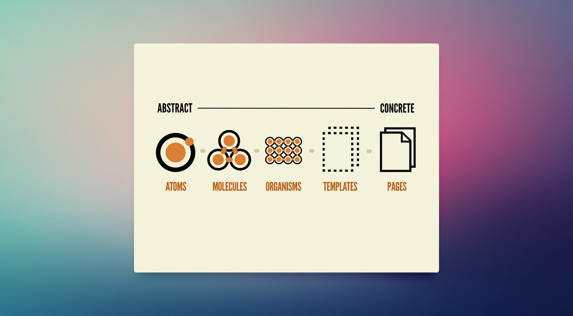
Atomic patterns
Brad Frost’s Atomic Design Principles changed how I think about building interfaces — and more importantly, how I talk about building interfaces with engineers and product managers. The mental model is simple: UIs are made of small, reusable parts that compose into larger, more complex ones. Atoms become molecules, molecules become organisms. It sounds abstract until you’re in a sprint planning meeting and someone asks “can we just swap out the card header?” and you can answer with actual confidence instead of “let me check with engineering.”
In practice, I lean on third-party component libraries like Ant Design and JoyUI as my atoms. Not because I’m lazy — well, sometimes because I’m lazy — but because using battle-tested primitives lets me focus my energy on the parts that are actually specific to the product I’m designing. Buttons and inputs are a solved problem. Let’s solve the interesting problems.
// Importing Atoms from a third-party lib
import { Button, Card, Statistic, Space } from 'antd';

// Constructing Molecules or Organizms
const AwesomeMolecule = (props) => {
    const { some_prop } = props

    // This could be a response from an API
    const statistics_data = [
        {title: 'Foo', amount: 100},
        {title: 'Bar', amount: 200},
        {title: 'Zap', amount: 300}]

    return (
        <section className="custom-class-added-for-scoping">
            <Card title="Awesome" >
                <div className="flex gap-4">
                    {statistics_data.map(({title, amount}) => {
                        return (<Statistic key={title} title={title} value={amount} />)
                    })}
                </div>
                <div>
                    <Space>
                        <Button type="primary">Action</Button>
                        <Button>Operation</Button>
                    </Space>
                    {some_prop} ... more Atoms
                </div>
            </Card>
        <section>
    )
}
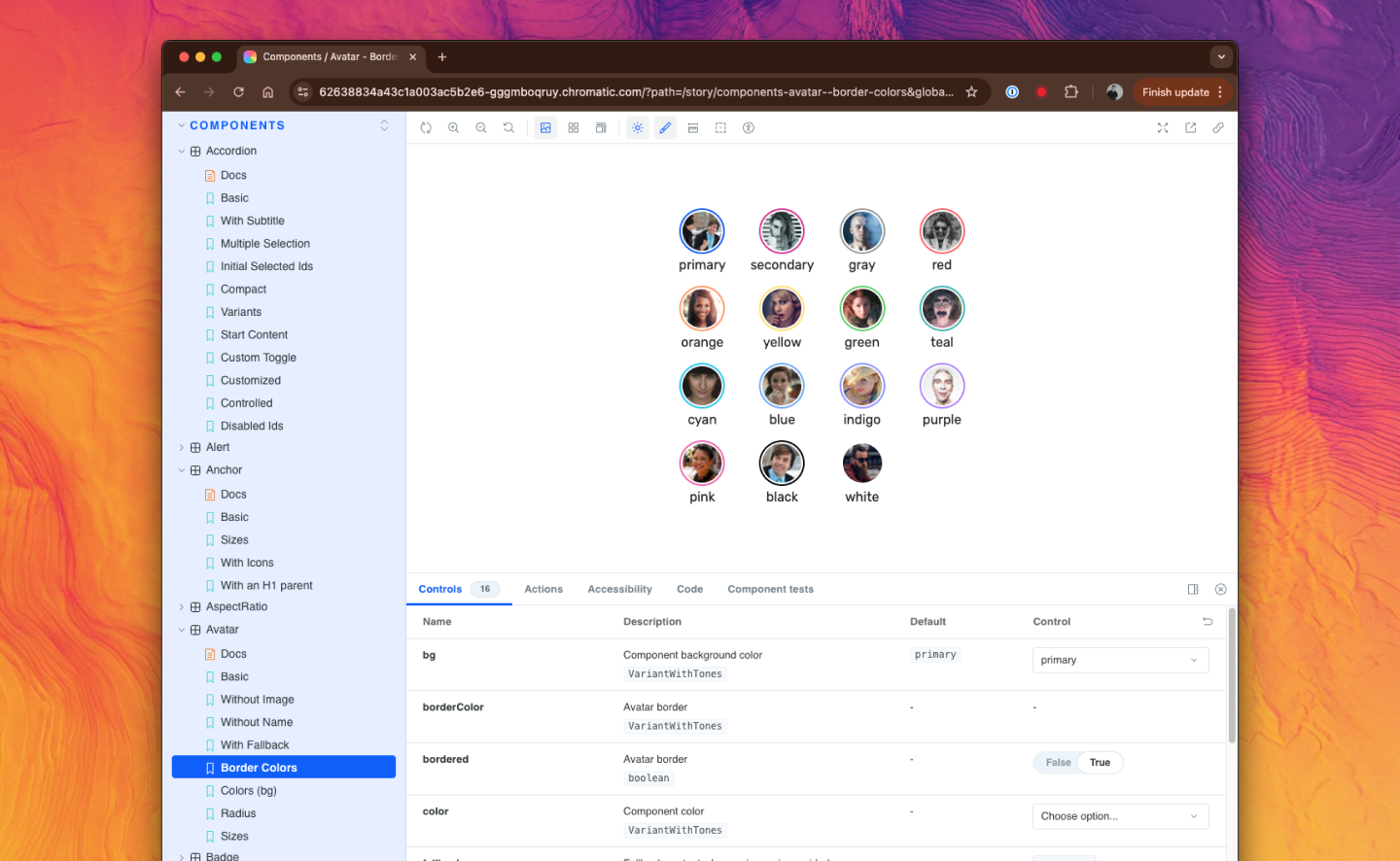
Once you’ve prototyped your way into a working set of components, the next move is to abstract them properly — pull out the business logic, make them composable, give them sensible props. And if you really want to level up, you document them in Storybook. Storybook is one of those tools that feels like overkill until you’re onboarding a new engineer and you can just say “here’s the component library, see how it works” instead of spending 45 minutes on a call.
Working this way has made me a better collaborator. Design can make decisions with confidence because the components are real. Product can verify that business objectives are being met at the component level. Engineering can build with the assurance that the pieces fit together. Everyone’s working from the same source of truth. It sounds idealistic, but I’ve seen it work — and I’ve also seen what happens when you skip this step. It’s not pretty.